Mastering Advanced Data Visualization Techniques
In today's world, data is everywhere. But raw data alone is not very useful. To understand patterns, trends, and key insights, we need to visualize the data in clear and attractive ways. Advanced data visualization techniques help businesses, researchers, and decision-makers understand complex data quickly.
1. Visualization Types
There are many ways to display data, and the right choice depends on the type of data and the story you want to tell. Here are some advanced types of visualizations:
- Statistical Plots: These plots show data distributions, trends, and comparisons. Examples include box plots, violin plots, and heatmaps. They are useful for analyzing large datasets.
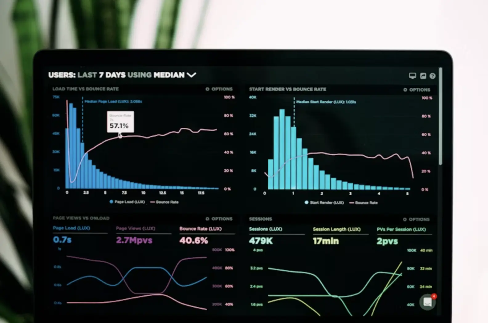
- Interactive Dashboards: Modern dashboards allow users to filter, zoom, and drill down into data. Tools like Power BI, Tableau, and Plotly make it easy to create interactive reports for business users.
- 3D Visualizations: When data has multiple dimensions, 3D plots can show relationships between different variables. These are often used in scientific research, simulations, and geographic data analysis.
- Network Graphs: Network graphs display connections between different items. They are very useful for visualizing social networks, supply chains, and website links. Tools like Gephi or D3.js help create these graphs.
2. Tools and Libraries
To create these visualizations, many powerful tools and libraries are available. Choosing the right tool depends on your programming skills and project requirements.
- Python Libraries: Python offers libraries like Matplotlib, Seaborn, Plotly, and Bokeh for creating a wide range of static and interactive visualizations. Python is popular among data scientists.
- JavaScript Frameworks: For web-based visualizations, JavaScript libraries like D3.js, Chart.js, and ECharts allow highly customized and interactive graphics. These work well for online dashboards.
- BI Tools: Business Intelligence tools like Tableau, Power BI, and Looker allow non-programmers to create beautiful dashboards quickly. These tools connect directly to data sources and offer drag-and-drop functionality.
- Custom Solutions: For very specific needs, companies can develop custom visualization platforms using web frameworks (React, Angular) combined with visualization libraries like D3.js or Plotly.
3. Best Practices
Good visualization is not just about showing data — it's about making data easy to understand and visually appealing. Following these best practices can improve your visualizations:
- Color Theory: Use colors wisely. Avoid using too many colors in one chart. Use consistent color schemes to show categories, and make sure your charts are color-blind friendly.
- Layout Design: Arrange charts and visual elements in a clean and organized way. Avoid overcrowding your dashboard. Use white space to give the viewer's eyes a break.
- Interactivity: Adding interactive elements, like tooltips, filters, and drill-down options, helps users explore data on their own. Interactive dashboards are great for business users.
- Performance: Large datasets can slow down your visualizations. Optimize performance by aggregating data, pre-computing summaries, or using efficient data formats (like Parquet).
Advanced data visualization techniques help turn complex data into clear and useful insights. By choosing the right visualization type, using appropriate tools, and following design best practices, you can create effective and attractive data presentations that support better decision-making.